Project Details
Date: April 17, 2017
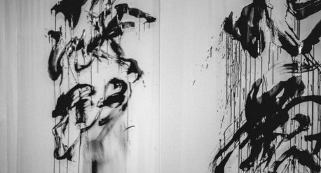
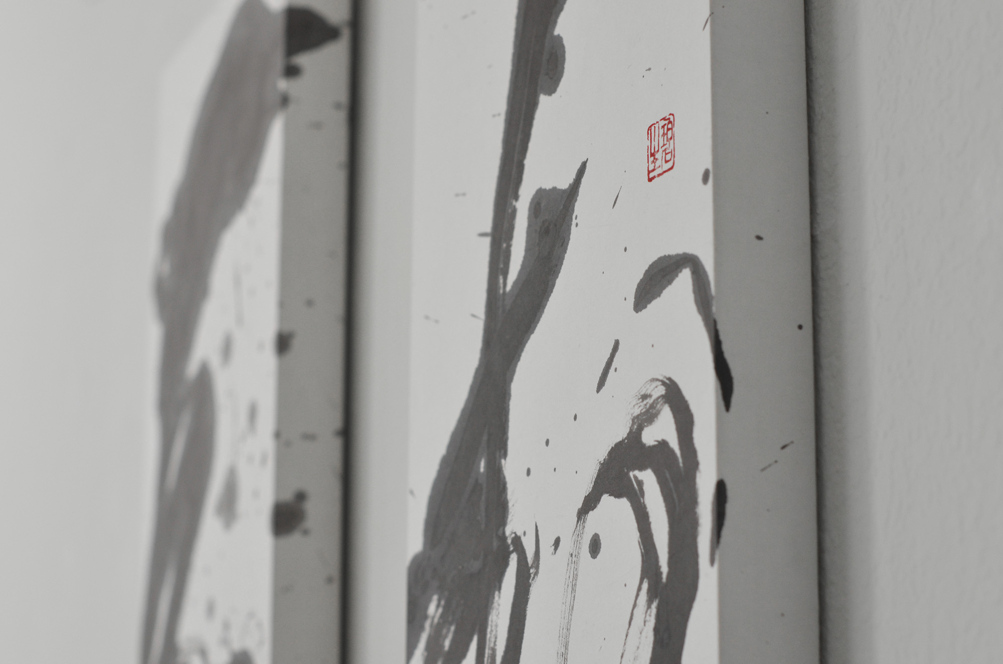
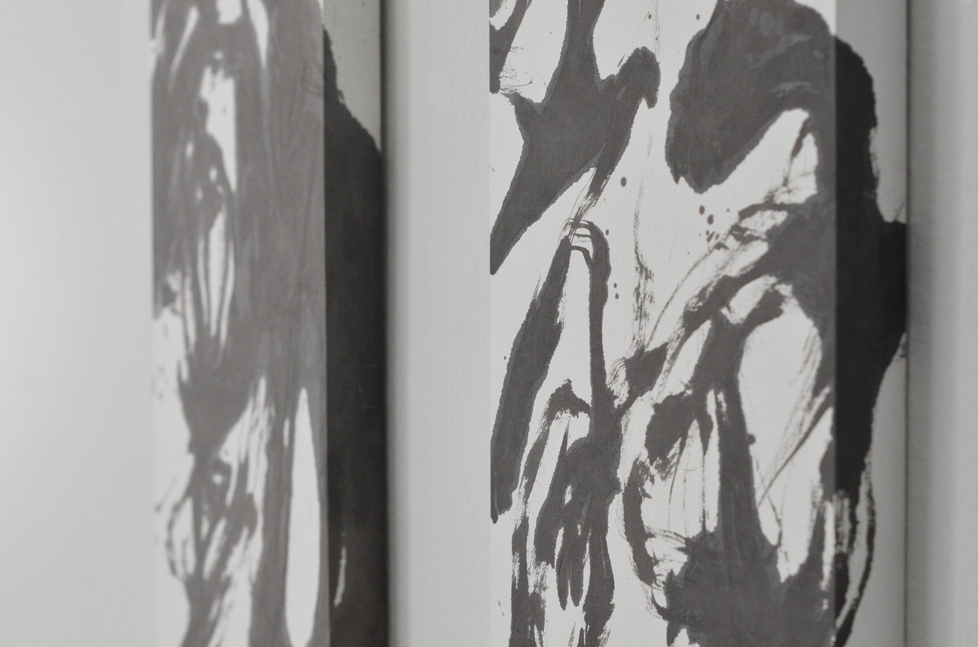
Japanese Calligraphy is a unique art form in that it seeks to deconstruct, rearrange and infuse existing linguistic elements into a a physical expression of an idea.
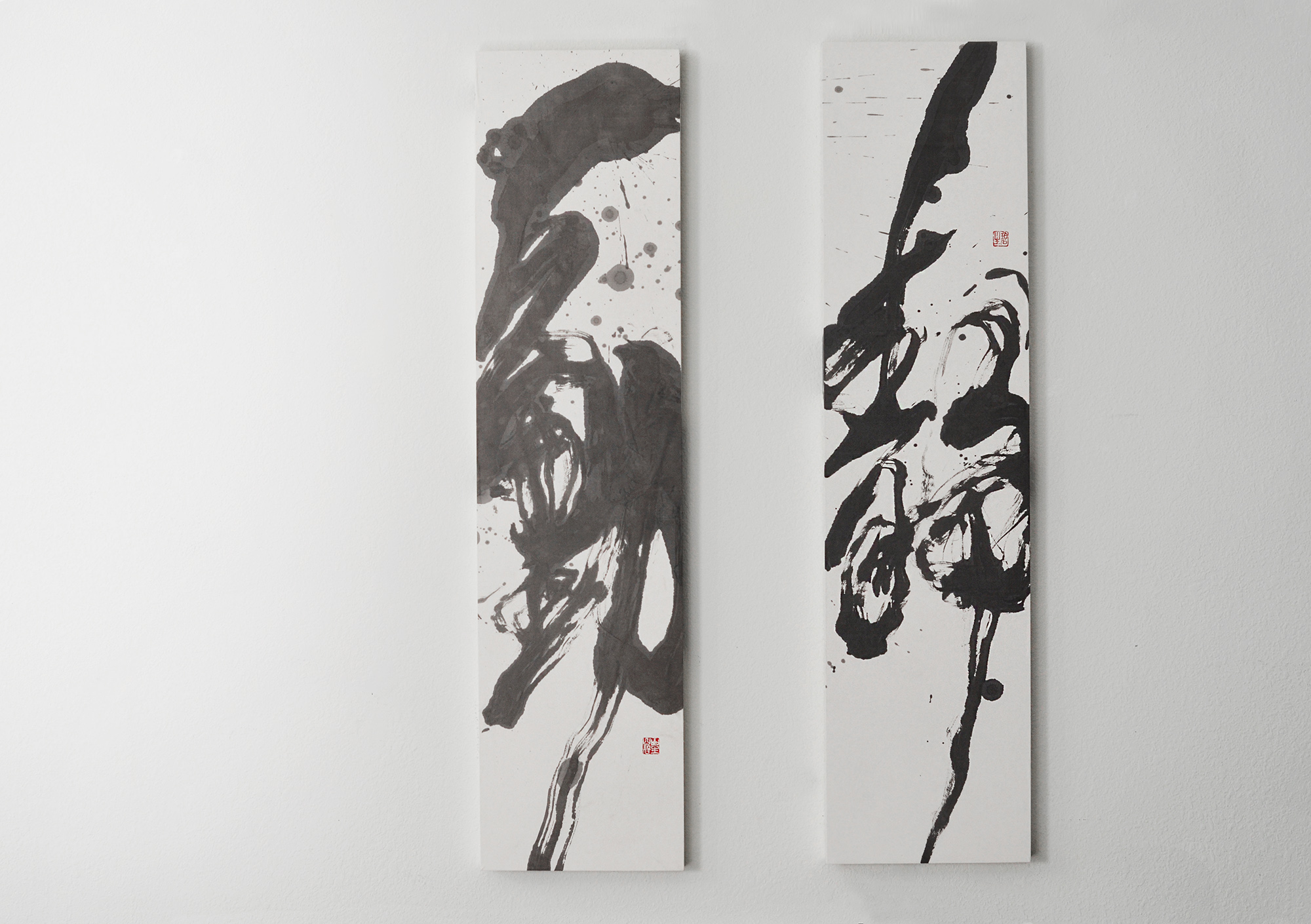
My idea was to work on a set of words that with contrasting meanings but whose vertically-shaped characters compliment each other and the rectangular panels that house them. Choosing characters with this shape allows me to focus the energy of the composition from the top of the panel to the bottom and beyond. Traditionally, Japanese reads from right to left: from the right “静 (Stillness)”, and to the left “動 (Motion)”.
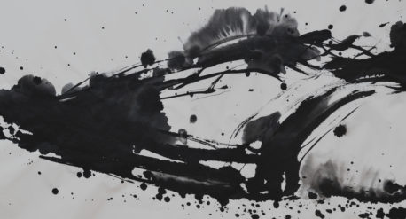
The chemistry between tanboku (light-colored sumi ink) and Japanese gasen paper is vivid and magical. From the moment the ink touches the paper, the ink fuses with paper and ripples out. With the right balance of water and sumi written in an unbroken motion, clear brush stroke edges emerge as the water evaporates. I chose warm black sumi to work on this piece, which, when mixed with the right amount of water, leaves behind hues of gray that illuminate the distinction between light and shadow.
Stillness is clear, graceful and light; Motion is blurred, dynamic and bold. Together, it completes the world of light and shadow, and neither exists without the other.